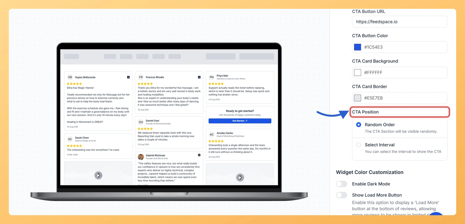
The Masonry widget displays your reviews in a Pinterest-style staggered grid, arranging cards across multiple columns of varying heights so visitors can scan a large number of testimonials at once. The Inline CTA design option lets you insert a call-to-action card directly inside that grid, sitting naturally among the review cards as a peer column item rather than appearing above or below the widget.
Because the Masonry layout keeps visitors engaged as they browse through many reviews, an inline CTA card captures their attention at exactly the right moment, when social proof has already built confidence. You can control where the CTA card appears in the grid by setting its position to Random or to appear after every X reviews, so it surfaces at the most impactful point in the browsing flow. You can fully customise the card’s heading, body text, button label, button URL, button colour, card background colour, and card border to match your brand and conversion goal.
How to add an Inline CTA to your Masonry widget
Step 1: Open the Widgets section
Log in to your Feedspace account. In the left sidebar, click Widgets to open the list of all widgets you have created.
Step 2: Edit your Masonry widget
Choose the Masonry widget that will carry the call to action, then click the Edit (pencil) icon on its card to open the editor.
Step 3: Go to the Design tab
Inside the widget editor, click the Design tab at the top of the panel. This tab contains all visual and layout customisation options for your Masonry widget.
Step 4: Find the Inline CTA Section
Scroll down within the Design tab until you reach the Inline CTA section. Toggle the switch to On to enable the CTA card. The configuration fields will expand once the toggle is active.
Step 5: Configure the CTA Card fields
Fill in each field to build your CTA card:
CTA Heading Text: A short, attention-grabbing headline for the card, such as “Ready to collect more reviews?”
CTA Body Text: One or two sentences that support the headline and give visitors a reason to click.
CTA Button Label: The text shown on the button, such as “Get Started” or “Try for Free”.
CTA Button URL: The destination URL the button links to when clicked.
CTA Button Color: Pick a colour that matches your brand or stands out against the card background.
CTA Card Background: Set the background colour of the CTA card so it blends with or contrasts against the surrounding review cards.
CTA Card Border: Optionally add a border colour to define the card edges within the grid.
Step 6: Set the CTA Position
Use the CTA Position control to decide where the CTA card appears within the Masonry grid. Choose Random to let Feedspace place the card in a non-predictable column position, or choose Every X reviews and enter a number to insert the card at a fixed interval, for example after every 6 review cards. An interval between 4 and 8 keeps the CTA visible without interrupting the browsing experience too frequently.
Step 7: Save and preview
Click Save & Next to apply your changes. Use the widget preview to confirm the CTA card appears correctly inside the Masonry grid at the position you chose. If the card placement or styling needs adjustment, return to the Design tab and refine the settings before republishing.
What’s next
Adjust the CTA position interval to test whether appearing after every 4, 6, or 8 review cards produces a higher click-through rate on your embedded Masonry widget.
Update the CTA Button URL to point to a specific landing page, sign-up form, or product page that matches the testimonials shown in the Masonry grid.
Customise the CTA Card Background and Button Color to align with your site’s design system so the card feels like a natural part of the page rather than an advertisement.
Explore other Design tab options for your Masonry widget, such as card spacing, and review card styling, to create a cohesive layout that complements your new inline CTA card.
Common questions
What is the difference between Random Order and Select Interval?
Random Order drops the CTA card into the grid wherever it happens to land. Select Interval lets you decide the spacing instead, choosing between a minimum of 4 and a maximum of 15 reviews between each appearance.
You might also find helpful
How Do I Change the Card Background Color on My Masonry Widget in Feedspace?
Overview The Masonry widget displays your reviews in a Pinterest-style staggered grid, arranging cards across multiple columns at varying heights so visitors can take in many reviews at once. Because each card floats independently in that open grid layout, the card background color is one of the most visible design...
How to Create a Masonry Widget in Feedspace
Overview The Masonry widget in Feedspace arranges your reviews in an elegant grid layout of varying card sizes, similar to Pinterest-style walls. It’s perfect for showcasing multiple reviews together while maintaining a modern, responsive design that automatically adjusts across devices. How to Access Step 1 – Log in to Feedspace...
How Do I Customize the Design of My Widget in Feedspace?
Overview Every Feedspace widget has a Design tab where you decide how it looks on your site: colors, font, card borders and shadows, what each review card shows, and an optional call-to-action card. Each change appears in the live preview as you make it. A common case: you embed a...